-
Client
Photofeeler
-
Services
Product Strategy, Research, Creative Direction, Branding, UI/UX Design
-
Design Timeline
6 Months
-
Brief
Design and build the companion app to the highly successful Photofeeler marketplace. The product hadn’t been updated in over half a decade. The goal was the build an app that respected what had made the desktop original great while modernizing the visuals and adding features, leveraging our deep market knowledge to turbocharge growth and revenue.
-
Outcome
Incredible 20% lift in Revenue from pre to post-launch.
Project Background
Photofeeler has been wildly successful for over 10 years and is the only trusted photo review website for dating app photos and professional photos. Despite this success, the product entered a phase of growth stagnation due to an outdated and dense responsive website.
Creating the first Photofeeler app would shrink the distance between photo upload, photo voting, and photo reviews, the three core user actions. Our hypothesis was that a modern mobile app, using updated and stylized branding and tweaking core UX, would lead to increases across KPIs and revenue.
The Market
Photofeeler was already a highly successful lifestyle business, but it was built on the back of an outdated, stagnant desktop-centric web app. The demographics of dating websites skew young, 53% of dating app users are under the age of 29. These customers have a modern expectation for their web and mobile experiences, especially in dating. They expect the products they use to be on-trend and easy
Additionally, 90% of Photofeeler’s customers were men. This created a problem for their two-sided marketplace, Photofeeler had to pay for women to use their platform to generate enough votes in both directions. This was a large cost, and often lead to worse user experiences in long test times.
The original Photofeeler web app. Not quite up to 2024 standards.
Why Mobile?
Most user’s dating app photos (and professional photos) are stored on their phones (or cloud storage). I knew that we needed to meet users at the source with a mobile-first app. Uploading photos directly from a user’s device would lead to a more seamless experience and likely lead to more photos uploaded (and thus more tests run and more revenue for Photofeeler).
When we looked at where our target market would spend their time it was primarily dating apps as well as the related apps in the photo improvement ecosystem. Almost all dating apps these days are mobile-centric, with the ability to upload (and sometimes even modify) photos directly from a user’s phone. Related apps in the dating/photo improvement ecosystem (like FaceApp and VSCO) have been extremely successful with a mobile-first approach.
Project Goals
There were some extreme business and product constraints on this project that were uncommon for a project of this type or scope.
Maintain Functionality
-
The Photofeeler desktop version was already established and had a strong product market fit. Because of its success, changing the core functionality wasn’t an option. Thus, the design had to be sensitive to the current mobile responsive version, and include and maintain the ability to vote on photos in all categories, create a test under different categories, see your results in all the current formats, and include a system for credits and karma. These features were non-negotiable and I was tasked to work within this strict framework.
Maintain Statistical Integrity
-
Photofeeler has one of the most valuable datasets in online dating, with datapoints on hundreds of thousands of photos. The data is not just how attractive a subject is, like the data from Tinder or Bumble, but far more detailed and useful. The data includes metrics like whether the subject looks smart or confident. This data relies on the scientific accuracy of the voting process, so the design had to be sure not to modify or influence the voting in a significant way. Furthermore, Photofeeler employs extremely advanced automated tooling to catch and suspend the votes of bad actors. Because of this, modifying the voting system dramatically would lead to throwing off the calibration of these finely tuned tools.
Improve Key Metrics
-
I worked with the client to identify the key metrics for this project, including top of funnel conversion, number of photos uploaded, and amount of tests run per user. I wanted to ensure that this was not just a shiny new coat of paint, but that I made material improvements on the actual business of Photofeeler. Metrics like photos per user and tests per user are key proxies for revenue and retention, and overall, satisfaction with the product. There was clear low hanging fruit when it came to improving the speed and efficiency with which users could upload photos and start tests, so this was a key area of focus.
Improving Marketplace Dynamics
Improving Marketplace Dynamics
The Karma Cycle
Photofeeler is a marketplace where users are paid in “karma” to give feedback on other user’s photos. Thus, it suffers from the same problems that many marketplaces suffer - without enough users on either side of the equation the entire feedback loop starts to suffer and disintegrate.
Demographics & Gender - A 4 Sided Marketplace
There is an additional dimension to the marketplace. Not only do users need votes to get many votes on their photos, but they want those votes to come from the specific gender/demographic they’re targeting.
That is - if you’re interested in dating men, you want votes from men primarily, and similarly if you’re interested in dating women you want votes from women. This creates a ~4-factor marketplace:
Male (or Non-binary) vote requesters
Female (or Non-binary) vote requesters
Male (or Non-binary) vote senders
Female (or Non-binary) vote senders
The data bears that an imbalance in gender voting slows down results and creates massive costs for Photofeeler. Resolving issues around the 4 sided marketplace was paramount for creating a financial return on this project.
The Problem: Not Enough Votes from Women
Photofeeler had solved getting votes from men. But it significantly lacked the other side of the marketplace - votes from women.
It had such a lopsided distribution of men vs. women users that men’s votes actively cost Photofeeler substantial money. To overcome the imbalance they had to employ numerous tricks to restore the balance.
Reasons for the discrepancy:
Photofeeler was desktop first. Women spend 39% more time on mobile devices than men and are far more likely to be mobile-first or mobile-only. The existing responsive Photofeeler website was clunky and challenging to use. There was no mobile app.
The primary use case for Photofeeler is improving dating profiles. The problem is that women are far less likely to need feedback on their dating photos for a variety of reasons. They usually have more choices in online dating, and more friends willing to give them feedback on their profiles.
One of the most prevalent personas we identified in the existing app was the “optimizer”. This person got value (and often truly enjoyed) optimizing their online dating profile, including improving their photos. This person was far more likely to own a laptop or desktop, to be a developer or in STEM, and thus was far more likely to be male.
Photofeeler Personas
I interviewed the founder and looked through the data on user demographics, looked at user profiles, and utilized my own experience as a user. It was clear there was one persona that dominated the current user base and accounted for the majority of Photofeelers revenue. We knew that we had to maintain what was working for these users while attracting more users in the other persona buckets.

Wireframing
The below wireframes are a sample of the wireframing process for the “My Tests” screen. The goals were to figure out ways to display the results in a more condensed fashion to put more tests on the screen, as well as create a new model for credits and karma as separate entities, showing the test speed, and incorporating an “Add votes” button. The reason for almost all of these changes was to educate the users better on the differences between paid and unpaid tests and to give users clearer paths and gentle nudges towards upgrading.
I don’t always do wireframes for every project. This is a decision based on the design timeline, cost/benefit analysis, and the overall complexity of the design. In this project, we felt that the complexity and net-new designs warranted a comprehensive approach.

Additional Process Thoughts
You’ll notice there wasn’t a prototyping stage to any of this work, we will jump right into the finished product. That’s because I am always sensitive to clients’ budget and timeline constraints, and I know my developers well and their abilities. We optimized for production-testing - we could iterate and test almost as quickly in production, with much more clarity and direction. I’m for the judicious application of any of the tools in the design process.
Launch something with a hypothesis, and then validate or invalidate that hypothesis and iterate on your results.
Brian Chesky on why testing product without a hypothesis doesn’t work
Project KPIs
Project KPIs
Tests started per user
We hypothesized that a mobile first design with easy photo access would encourage users to batch upload photos, increasing both photo uploads and test starts. Since similar apps are mobile first and most users store dating photos on their phones, this approach seemed likely to boost uploads. We also planned a batch test start feature to drive more tests per user, but it was cut during design due to time constraints.
Increased revenue per paid test
In paid tests, users pay a fixed fee per vote, so a 40 vote test earns more revenue than a 20 vote test. Larger tests provide higher statistical significance, making results more accurate and reliable. But Photofeeler gave little context about why more votes mattered or what statistical significance meant. We hypothesized that educating users on this would encourage them to pay for more votes per test, slightly increasing spend per test.
Increased Votes cast per user
The more votes users cast, the lower the cost for Photofeeler when running paid tests, so this KPI was about reducing costs rather than boosting revenue. While I had larger ideas like overhauling the voting system, many were cut early due to complexity and timelines. Instead, I focused on smaller changes: improving the voting page’s look and feel (e.g., a more engaging Karma Bar, better colors, larger photos), clarifying the difference between Karma and Credits to increase motivation, lowering barriers to voting through UI tweaks, and increasing voting by women.
Improving Votes Per User - The Theory
Every time there’s an imbalance in the number of votes required to complete a user’s test vs the number of votes being cast - Photofeeler loses money. This amount can be quite substantial and accounts for up to 30% of Photofeeler’s revenue and is the biggest cost to the business. I knew that if I could increase the number of votes per user it would have one of the biggest impacts on Photofeeler’s bottom line.
-
Here's a dramatic statistic: Women spend 79% more time looking at pictures on their phones than men. There was some juice to squeeze here. We looked at user reasons for using apps like Tinder and Instagram, two of the biggest “people watching” apps. The consensus was that simple interactions that allowed women to feel like they were interacting with the photo were what created the most engagement. However, the current version of Photofeeler required more user thoughtfulness and was more statistical. Ultimately I explored multiple ways to simplify and create a more interactive, engaging voting page.
-
This meant that first we needed to meet people where they were - on their phones. Just like people mindlessly scrolling on Tinder or Instagram, we wanted Photofeeler to be a destination for photos of people. By making a fun voting and photo review experience on a mobile app, instead of users having to go to a janky mobile website they could access this experience right from their phones.
-
One of my biggest points of emphasis was improving access to the voting screens through UX and in-app cues. The original desktop version had voting hidden within a second menu (see picture), I pushed for moving that to part of the core navigation and increasing call-to-actions all over the app to encourage users to vote.
-
There are two systems of currency in Photofeeler. The first is “Karma” which is shown in the info-graphic above and is the reward users get for voting that allows them to start their tests, for free. The second is “credits” which are essentially “skip the line” passes, and allow users to pay for results immediately, and is the main way Photofeeler monetizes.
In my interviews with the business owners and examining support tickets, it was clear that these systems were confusing to users and that they were not prominently indicated enough to drive behavior. My designs focused on giving unique branding to both systems to help differentiate them, increase the visibility of karma levels, and drive education of what both systems mean and how they power the app.

The Results
The end result is a far more polished, more usable, more modern experience for all of Photofeeler’s users, not just the dominant personas. I was able to design an app within a challenging budget and scope with strong hypotheses about how to improve KPIS while ensuring what made the current product so effective was respected and maintained.
Improving the Feedback Screens
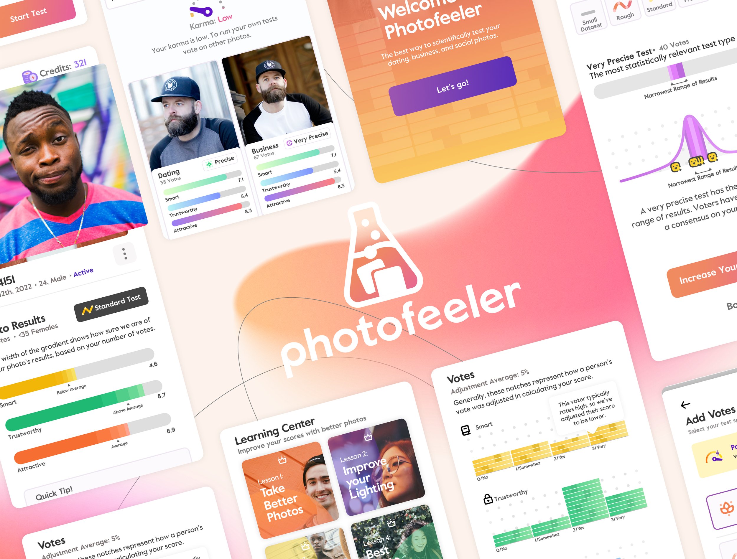
Photofeelers photo test result screens were tried and battle-tested, and there was a lot of optimization that went into how the data was presented to the user to create the least confusion. Complicated statistical analysis were happening in the background, and communicating things like “confidence intervals” to a user is challenging. I worked to streamline, the results experience while maintaining what made great about the data communication from the original version. I up-leveled the styling and created a more modern experience to appeal to a wider range of users.
Tweaks to Increase Voting
This was the area of the app most restricted by stakeholder’s desire to maintain the highest levels of data integrity. Thus, while we explored multiple ways to make voting more fun, engaging, and ultimately more frequent for users (and solve some of the gender dynamics problems), I was limited to re-using the same UX, color scheme, and general layout. I focused on making lightweight tweaks to make the screens feel more dynamic and enjoyable for users. The biggest improvements could be seen on the “quicknotes” screens, where I worked to modernize the interface and make the interactions more accessible and clear. If we could tweak out even just 1-3 more votes or notes/user for women that would pay dividends in the form of tens of thousands of dollars for the business.
Modernizing the Trait Colors
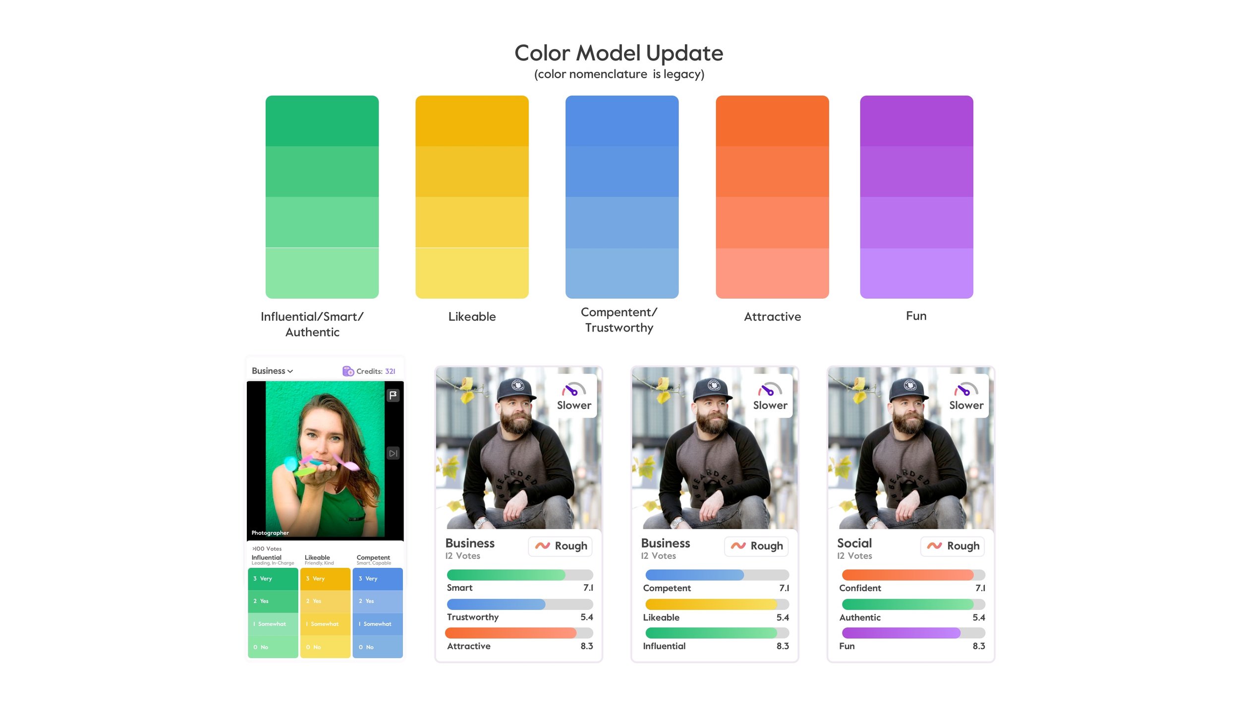
As part of the broad branding updates I worked on across the product, I wanted to update the colors for the system wide traits, as well as incorporating intentional gradients to indicate scoring levels. There was no mandate to change the overal category of each trait color because of concerns over data integrity (i.e. “Likeable” had to stay broadly “yellow”) but I tweaked their hue and then added in a system for a 4 stepped gradient, further differentiating a “very” vote from a “no” vote.

Improving Statistical Communication
Photofeeler’s revenue model depends on the user’s understanding of key statistical principles - namely - sample size and confidence intervals. Photofeeler makes money when users pay for larger sample sizes, tighter confidence intervals (as well as faster tests). While many of us know how sample size impacts statistical accuracy, it’s not always common knowledge, and thus it was a key goal of mine to improve statistical communication throughout the app. This was especially key on the upgrade screen, where communicating the value of the higher tiers of tests was key to purchasing behavior. Further additions were clarifying confidence intervals, vote weighting, and adding a dynamic section on sample size impact on test accuracy.
Custom Iconography
As part of the mission to improve communication around complex statistical ideas I theorized that it was important to develop a custom set of symbols to signify the different statistical levels of a test. This provided two primary benefits - it differentiated the sample size levels of different tests and created a mental model for the statistical levels , and provided a branding trigger during the upgrade process to invoke these statistical differences.
Additionally, it was important to clarify how credits and karma work together to power tests. Thus I developed a new symbol for credits and created a guage system for measuring user’s banked credits and karma.
Increasing Tests Started
A key KPI was increasing “Tests started per user” so the start of a test flow was a natural place to put a lot of attention, especially on the UX. Unlike its dating app peers, Photofeeler has never had the ability to upload a batch of photos and start multiple tests. On Tinder, for instance, you can upload your entire group of profile photos in one go. This is even more important on Photofeeler because photos aren’t just for show - they’re for starting tests, and tests are where Photofeeler makes money! In response to this, I designed a multi-photo upload and test start process that allows users to start tests in batches.
Additionally, Instead, the test start process did a bad job of communicating the differences in test types and the importance of vote count (which is the upgrade condition). Thus, the hypothesis was increasing test type communication and sample size communication would lead to more non-dating tests starting (persona crossover) and users upgrading to larger tests.
Custom Splash Animation
Part of the work of this project included a very light branding refresh. I redesigned the Photofeeler logo keeping the what worked with the current logo (the shape, general premise) but reworked it to make it seem less like an icon downloaded from google.
In addition, I designed and managed a project with an outside resource to develop a custom splash animation for the logo on app startup. I designed the storyboard, and handed it over to our resource who animated the final version in after effects.
Dramatic Desktop Improvements
Whilst a key hypothesis was “meeting users where they are”, aka a mobile-first design philosophy, would lead to more started tests and more revenue, I didn’t want to neglect the first persona in our list “The Optimizer” who was more likely to be comfortable in the desktop experience. Further, desktop was underutilized from the power user/The Optimizer perspective. There were many opportunities for data visualization that weren’t being explored, as well as generally bad data heirarchy across the board.

The Outcome
Since its partial launch (many of the design elements are implemented on the responsive web app) Photofeeler has seen an incredible 20% jump in sales, as well as conversion jumps across all elements of the funnel.
Results are still coming in from the changes to the responsive web app and outcomes will be updated as new results roll in.


